Boxplots and bubble plots with ggplot2
TL;DR
I like pretty plots so here is how I make nice boxplots.
Making plots is R is the best part of any data analysis project. In this blog post, I want to share my workflow of making publication-ready boxplots and show my bubble-box plots.
Background
(skip this if you’re here just for the plots)
The data used in this analysis was produced by metaCCA method, which takes as input summary statistics of several GWAS studies (of related traits) and outputs canonical correlation (CC) values of each SNP with all traits in the input GWAS studies. In other words, metaCCA helps to identify SNPs that may be involved in several biological processes/traits, i.e. could be pleiotropic.
The GWAS studies I used in this analysis measured phenotypes like BMI, weight, fatness, waist-to-hip ratio, as well as blood pressure. I was interested in finding SNPs that correlate with all of those traits.
The output of metaCCA is r_1 CC value with a corresponding p-value. To understand whether my analysis picked up SNPs related/correlated with the input traits I needed to check what phenotypes they have previously been found to associate with. To do this, I extracted all my analysed SNPs from the GWAS catalogue along with their previously reported associations. [As expected, only about 20% of SNPs in my analysis had a catalogued trait association, but that was sufficient to start with]. Then, I have grouped the verbose trait descriptions into summary categories, e.g. Cardiovascular, Neurological, Renal, and annotated each SNP (when possible) with those.
Data
Each data point (SNP) has got a
- correlation coefficient value [0,1] -
r_1 - p-value -
pval - category of previously observed association -
trait_summary
We are interested in:
- size of each category
- distribution of values across the entire dataset and within each trait category
- relationship between correlation values and their significance levels
Building the visualisation
library(dplyr)
library(tidyr)
library(data.table)
library(ggplot2)
library(wesanderson)
library(colorspace)
library(cowplot)First look at the data
# read data and keep SNPs with labelled category
dat <- fread(paste0(data_path, "data.tsv"),
select=c("SNPS", "r_1", "pval", "trait_summary") ) %>%
filter(!is.na(trait_summary))# quick look at the data
dat %>% tail()
## SNPS r_1 pval trait_summary
## 1: rs7236090 0.002700215 0.9290937 Bone
## 2: rs3217869 0.002639231 0.9370659 Psychiatric
## 3: rs4654748 0.002335776 0.9676382 Miscellaneous
## 4: rs4654748 0.002335776 0.9676382 Miscellaneous
## 5: rs4654748 0.002335776 0.9676382 Miscellaneous
## 6: rs4654748 0.002335776 0.9676382 Miscellaneous# check number of data points per categoty
dat %>% count(trait_summary) %>% arrange(desc(n))
## trait_summary n
## 1: Miscellaneous 789
## 2: Anthropometic 322
## 3: Cardiovascular 178
## 4: Metabolic 177
## 5: Education 174
## 6: Cancer 160
## 7: Autoimmune 153
## 8: Respiratory 137
## 9: Neurological 106
## 10: Psychiatric 102
## 11: Bone 94
## 12: Appearance 75
## 13: Personality 60
## 14: Renal 36
## 15: Vision 21
## 16: Alcohol 20
## 17: Aging 15# set the (factor) order in which categories appear in the plot: alphabetic + misc is last
trait_categories <- sort(unique(dat$trait_summary))
trait_categories <- c(trait_categories[trait_categories != "Miscellaneous"], "Miscellaneous")
dat$trait_summary <- factor(dat$trait_summary , levels = trait_categories)
Basic boxplot
Let’s start with simple boxplots by category -
ggplot(data = dat,
mapping = aes(x = trait_summary, y = r_1, fill = trait_summary)) +
geom_boxplot() 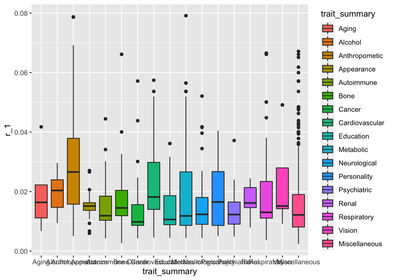
This plot serves the purpose of showing what is going on in the dataset, but we can make it look a lot nicer than this.
Tidy the axes
Firstly, let’s get rid of ggplot2’s default grey background! I’ve recently discovered cowplot package, which is an add-on to ggplot2 that transforms R plots into publication-ready figures. Also:
- the overlapping x-axis labels need to be rotated to be readable. Not 90 degrees though (the golden rule of data viz: a plot has to be readable without having to tilt your head!)
- remove the colour legend, it’s redundant here
- add descriptive y-axis label, remove x-axis label, add a title!
ggplot(data = dat, mapping = aes(x = trait_summary, y = r_1, fill=trait_summary)) +
geom_boxplot()+
# cowplot theme
theme_minimal_hgrid(9, rel_small = 1) +
# rotate x-axis labels, drop legend
theme(axis.text.x = element_text(angle = 35, hjust = 1),
legend.position = "none")+
labs(title="metaCCA results grouped into known SNPs association groups",
y = "Canonical Correlation (CC) value (r_1)", x = "")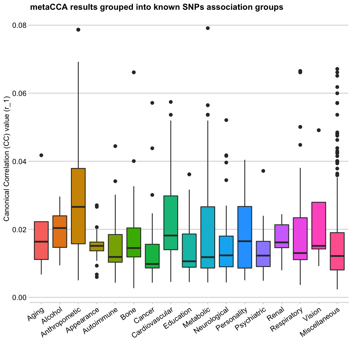
It’s time for nice colours
As much as dislike grey background, even more, I resent the rainbow palette. Using it on a categorical data is not a major problem (other than it looks ugly), here is why you should never use it on continuous data.
I’m always on the lookout for new palettes. Recently I’ve discovered a Wes Anderson movies-themed palette R package, and it’s wonderful! The author’s README says “I saved you from boring plots” and it’s so true. I believe the package was inspired by the tumblr account wesandersonpalettes.tumblr.com, so many great palette ideas there!
The only drawback of these palettes is that they are all quite small, so for my multi-category plot, I will need to make a frankenstein palette. For my current data, I like the colours in Darjeeling1 and Zissou1
wes_palette("Darjeeling1")
wes_palette("Zissou1")
Here is a finished palette for my 17 categories (skipping the steps of manually selecting the colours)
mypal<-c("#78B7C5", "#EBCC2A", "#FF0000", "#EABE94",
"#3B9AB2", "#B40F20", "#0B775E", "#F2300F",
"#5BBCD6", "#F98400", "#ab0213", "#E2D200",
"#ff7700", "#46ACC8", "#00A08A", "#78B7C5",
"#DD8D29")
# TIP: use scales library to view the palette you created
scales::show_col(mypal)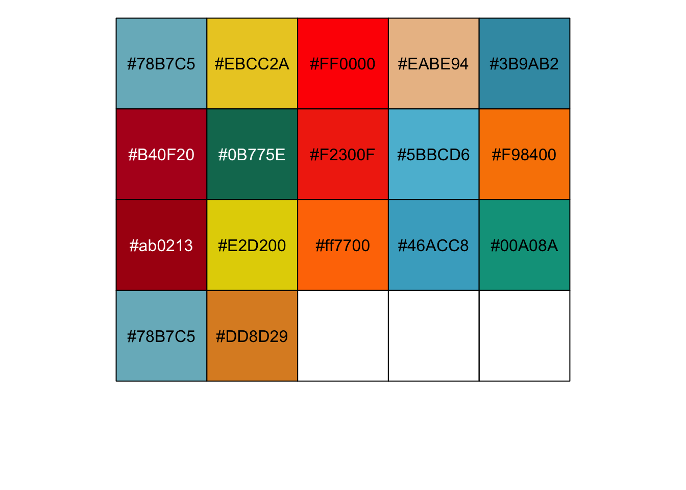 Adding my new palette to the plot -
ggplot(data = dat, mapping = aes(x = trait_summary, y = r_1, fill=trait_summary)) +
geom_boxplot()+
theme_minimal_hgrid(10, rel_small = 1) +
# add manual palette
scale_fill_manual(values = mypal)+
theme(axis.text.x = element_text(angle = 35, hjust = 1),
legend.position = "none")+
labs(title="metaCCA results grouped into known SNPs association groups",
y = "Canonical Correlation (CC) value (r_1)", x = "")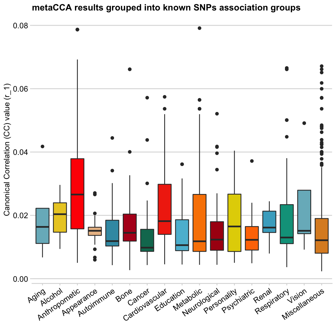
These boxplots look much better to me 🎉
The colour choice here is random (and somewhat repetitive), except Anthropometric and Cardiovascular categories, which I made bright red to highlight the results of these groups.
Some discussion
(skip this if you’re here just for the plots; this will only make sense if you’ve read the data Background section, otherwise move on to the next section!)
The input data to the metaCCA analysis were several GWAS studies focused on body size and weight-related traits, as well as blood pressure measures. The CC values (y-axis) of SNPs returned by the analysis represent their correlation with all input GWAS traits. Having labelled all SNPs (when possible) by their previously reported association from GWAS catalogue, I was able to group them into categories (boxplots). In this way, I was able to visualise the data points summary (e.g. the mean, 1st and 3rd quartile, and highly correlated outliers in each trait group) as boxplots.
Going into any specific findings is beyond the scope of this post. Therefore, the main take away here is that the two categories of SNP correlations that seem to stand out are Anthropometric and Cardiovascular (annotated by GWAS catalogue!), which is concordant with the input GWAS traits.
Jitter plot
Next, I want to explore individual data points (SNPs) by adding geom_jitter to my plot.
ggplot(data = dat, mapping = aes(x = trait_summary, y = r_1, fill=trait_summary)) +
geom_boxplot()+
# add individual data points
geom_jitter()+
theme_minimal_hgrid(10, rel_small = 1) +
scale_fill_manual(values = mypal)+
theme(axis.text.x = element_text(angle = 35, hjust = 1),
legend.position = "none")+
labs(title="metaCCA results grouped into known SNPs association groups",
y = "Canonical Correlation (CC) value (r_1)", x = "")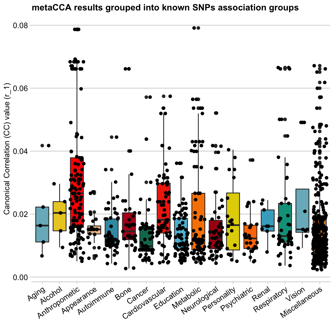
This does not look good - looks like a wasp attack! 🐝
So next I’m going to
- exclude the Miscellaneous group from the plot - it’s too large and heterogeneous (so not very useful for comparing categories)
- drop boxplots - we don’t need them any more
- add colours to the dots, make them larger and add transparency
… and that gives us a
Bubble plot
# filter out Misc group
dat <- filter(dat, trait_summary != "Miscellaneous")ggplot(data = dat, mapping = aes(x = trait_summary, y = r_1, colour=trait_summary)) +
# modify jitter geom to look like a bubble plot
geom_jitter(alpha=0.5, size =5, position = position_jitter(width = 0.4))+
theme_minimal_hgrid(10, rel_small = 1) +
scale_color_manual(values=darken(mypal, 0.08))+
theme(axis.text.x = element_text(angle = 35, hjust = 1),
legend.position = "none")+
labs(title="metaCCA results grouped into known SNPs association groups",
y = "Canonical Correlation (CC) value (r_1)", x = "")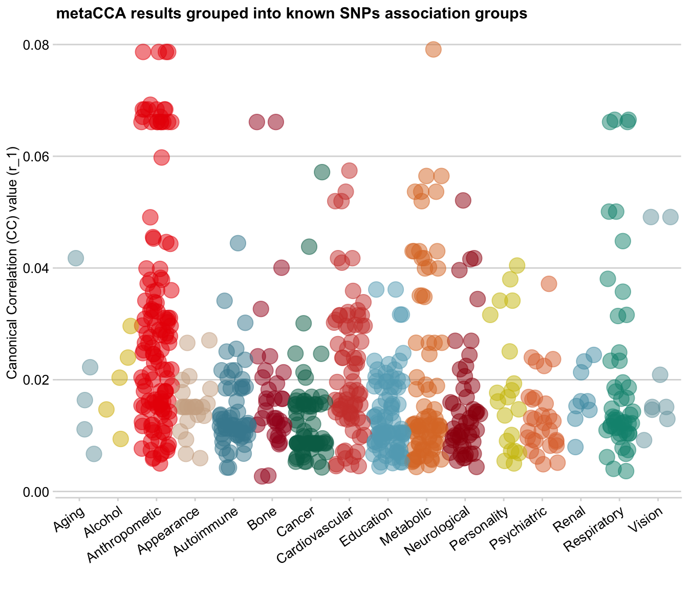
Looks nice!
Normally, a bubble plot is simply a scatter plot with an extra dimension added by the size of the dots. Here, I have used the jitter option that often comes with boxplots as my bubble plot base, so technically I already have an extra dimension of data grouped into vertical ‘box’ categories.
Adding size dimension
However, this dataset also contains significance levels for each data point. And we can use it as another dimension and add the p-values to the plot as the dot size!
Firstly, I converted all p-values that are < 10e-15 to 10e-15 (including those that just 0), as when it’s that low, the exact value does not matter any more. Then, I -log10() the p-values. So now, very low p-values on the log-transformed scale are 15, genome-wide significant p-values ~(10e-8) are 7, and the large p-values are closer to 0 on the log scale.
# first, create a usable p-value variable (truncated and log10-transformed)
dat <- mutate(dat,
# convert all super small pval into 1e-15
pval_truncated = ifelse(pval < 1e-15, 1e-15, pval),
# log transform pvals
log10pval_trunc = as.integer(-log10(pval_truncated)))Let’s make this plot!
ggplot(data = dat, mapping = aes(x = trait_summary, y = r_1, colour=trait_summary,
# add bubble size
size=log10pval_trunc)) +
geom_jitter(alpha=0.4, position = position_jitter(width = 0.4))+
theme_minimal_hgrid(10, rel_small = 1) +
scale_color_manual(values=darken(mypal, 0.08))+
theme(axis.text.x = element_text(angle = 35, hjust = 1),
# show legend on top (for size)
legend.position="top",
legend.box.background = element_blank())+
labs(title="metaCCA results grouped into known SNPs association groups",
y = "Canonical Correlation (CC) value (r_1)", x = "",
size = "-log10pval")+
# don't show legend for colour and transparency
guides(alpha = FALSE, colour=FALSE)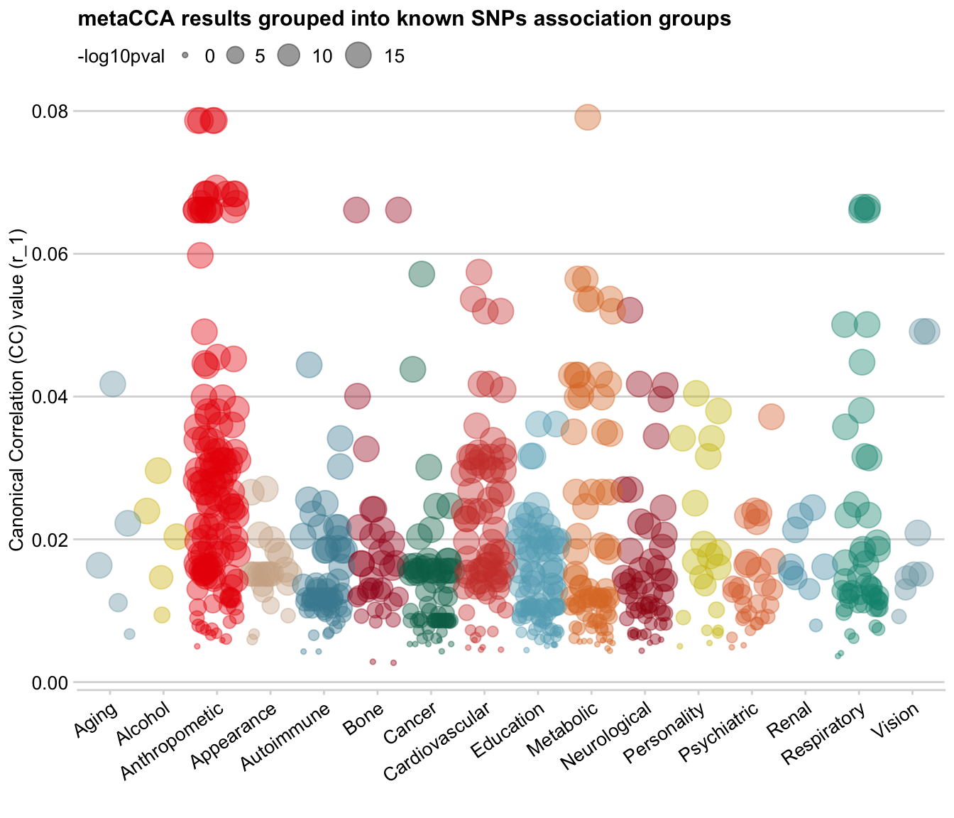
On the bubble plot, you can see that there is a positive relationship between SNPs’ correlation value (y-axis) and p-value (size): SNPs with low r_1 value also have low log-transformed p-values (i.e. large p-value), which makes sense.
I think this is where I want to stop for now. This purpose of this post is not to talk about the analysis I’ve done on metaCCA results, but to show my workflow and thought process from ugly-default-ggplot2 to publication-ready plot with nice colours (in my humble opinion!)
When playing with dot size, I accidentally made a hot-air balloon plot:
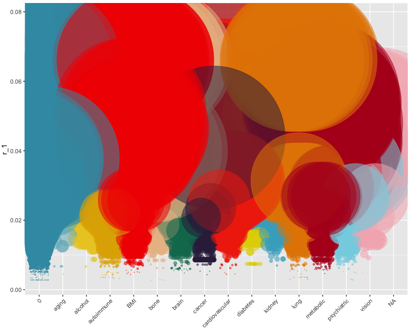 Reminded me of this - 😉

Header photo by AJI on Unsplash